During their playoff exit two months ago, the Sharks lacked meanness and aggression.
Problem solved. The new symbol will be a monster in the defensive zone.
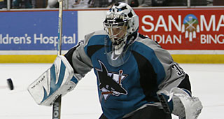
OK, maybe not. But the team unveiled its updated Shark logo Tuesday morning at HP Pavilion, replacing the mostly black-and-white version of the previous 16 years with one that has a teal top, orange eyes and a more menacing downward bite.
"We want our fans to have a strong affinity for this organization," Sharks CEO Greg Jamison said. "We think this logo will help be part of that."
T-shirts, hats and other apparel went on sale in conjunction with the announcements. The NHL is re-designing game uniforms, so jersey aren't expected to be available until September.
Sharks Unveil New Logo